Website Engagement Tools: Small Teams Should Test One, Not Five
Website Engagement Tools: Small Teams Should Test One, Not Five

Pick one target action, add a single low-effort engagement widget that supports it, and measure the change before adding anything else. The evidence on website engagement strategies backs this up: isolating one KPI and testing one interactive element beats bolting on five tools at once. Widget builders make the first pilot fast since adding a tool takes one line of code, not a developer sprint.
TL;DR:
- Record source pageviews, CTA clicks, form starts and completions, and landing page bounce rates for at least two weeks before testing a widget.
- Limit each pilot to one page, one widget, and one metric for two to four weeks, then keep it only if results exceed normal variation.
- Sites with only a few hundred monthly visitors rarely have enough traffic for reliable A/B tests, so compare equivalent periods before and after instead.
- Use live chat only when someone can answer promptly; otherwise, a scripted bot that sets reply expectations avoids leaving visitors with silence.
- Show popups no more than once per visitor session, delay them until page content loads, and make close buttons at least 44 by 44 pixels.
Table of Contents
- Why engagement matters and how to measure it
- Live chat and conversational widgets
- Feedback and survey tools
- Interactive content: quizzes, calculators, and guided discovery
- Popups, announcement bars, and contextual CTAs
- Personalization and recommendation widgets
- Gamification and lightweight rewards
- Analytics, testing, and the one-tool experiment workflow
- How to choose which engagement tool to add first
- Why Zyff is a practical widget-first option for small teams
- Author perspective: prioritize measurement and simplicity
- Try Zyff: get started with a free widget
- FAQ
- Sources
Why engagement matters and how to measure it
Website engagement describes how visitors interact with your pages: whether they read, click, scroll, return, or convert. Without a baseline, you cannot tell if a new chat widget or popup actually helped or just added clutter.
Start with a short list of KPIs tied to a single target action, whether that’s a form submission, a demo booking, or an add-to-cart click.
- Time on page or scroll depth, as a proxy for content relevance
- Click-through rate on your primary call to action
- Task completion rate (checkout finished, form submitted, quiz completed)
- Conversion rate from visit to the defined target action
Performance matters just as much as design choices. 91.9% of sites pass Interaction to Next Paint thresholds, according to The State of Web Vitals 2026, but the sites that fail usually carry heavy third-party scripts that slow down how fast a page responds to clicks and taps. Every widget you add is a script loading on top of your existing stack, so measuring before and after a change isn’t optional if you want to know whether the tradeoff was worth it.
Before installing anything, set up a baseline checklist: track pageviews by source, click events on your main CTA, form starts versus form completions, and bounce rate on your top three landing pages. That gives you a reference point for judging whether the widget you add next month actually moved the numbers.
Live chat and conversational widgets
Live chat, scripted bots, and simple AI receptionists solve different problems even though they look similar on the page. Live chat connects a visitor to a real person in real time. A scripted bot follows a decision tree to answer common questions or route a lead. An AI receptionist handles open-ended questions with more flexibility but still needs guardrails for anything specific to your business.
These tools fit naturally where visitors have a question that blocks them from acting: pricing pages, checkout flows, or service pages where booking requires clarification.
- Lead capture: a chat widget that collects an email before connecting to a human
- Booking assistance: a bot that walks a visitor through scheduling
- Support triage: routing simple questions away from your team’s inbox
Before you embed a chat tool, check how it handles data ownership (where transcripts live), whether it integrates with your CRM or just sits in isolation, and how it behaves on mobile where a chat bubble can block tap targets.
A slow response time can hurt engagement more than having no chat at all. If you can’t staff live replies promptly, a scripted bot with clear expectations (“we usually reply within a few hours”) protects the experience better than a chat window that goes quiet.
Feedback and survey tools
Micro-surveys, Net Promoter Score (NPS) prompts, and exit surveys each answer a different question. A micro-survey asks one quick question at a relevant moment, like “Did you find what you were looking for?” NPS measures loyalty with a single 0 to 10 question and works best as a recurring pulse check rather than a one-time popup. Exit surveys try to catch visitors right before they leave, which makes timing and targeting critical.
Getting the targeting right matters more than the survey design itself.
- Trigger micro-surveys after a meaningful action, not on page load
- Limit exit surveys to visitors showing exit intent on high-value pages
- Space out NPS prompts so returning visitors aren’t asked repeatedly
- Keep every survey under three questions to protect completion rates
Qualitative answers are often more useful than the score itself. A pattern of comments mentioning confusing navigation tells you more than a dipping NPS number alone. Track response rate as your primary health metric, and watch for shifts in the qualitative themes over a few weeks rather than reacting to a single day of feedback.
Interactive content: quizzes, calculators, and guided discovery
Quizzes, calculators, and other guided tools do two things at once: they keep visitors engaged longer and they segment those visitors based on how they answer. A pricing calculator tells you a visitor’s budget range before your sales team ever talks to them. A short quiz pointing shoppers to the right product mirrors the guided discovery approach that GoDaddy’s engagement research credits with measurable conversion lift.
Design these tools for clarity first. Short question sets, visible progress indicators, and plain-language results outperform anything clever or overly long.
- Keep quizzes under seven questions to protect completion rates
- Label calculator inputs clearly with units so results are trustworthy
- Offer a text-based summary alongside any visual result for accessibility
- Track each answer as its own event so you can see where people drop off
Pro Tip: Tag each quiz question as a separate analytics event so a single drop-off point doesn’t get buried in an overall completion number.
Watch completion rate first, then look at conversion lift among people who finished versus people who bounced partway through. A calculator with a 70% completion rate but low follow-through to purchase usually points to a mismatch between the tool’s promise and the next step you offer.
Popups, announcement bars, and contextual CTAs
Transient messaging covers a range of formats: exit-intent popups, scroll-triggered offers, slide-ins, and announcement bars pinned to the top of the page. Each works best for a specific moment rather than as a blanket tactic across every page.
The strongest practice across these formats is showing one message per session. Repeated popups on every page load irritate visitors and tend to suppress the metric you’re trying to improve. Timing also matters for accessibility: a popup that appears before a screen reader finishes announcing the page content creates a frustrating experience, which is part of why WCAG-friendly popup design treats delay and dismissal controls as core requirements, not polish.
- Use exit-intent popups only on pages with a clear next step (discount, newsletter, demo)
- Reserve announcement bars for time-sensitive or site-wide messages
- Cap popup frequency at once per session per visitor
- Make close buttons at least 44 by 44 pixels so they’re tappable on mobile, a standard covered in mobile popup design guidance
Third-party scripts are a common cause of slow interaction response, per The State of Web Vitals 2026, so a popup loading a heavy script library can undo the benefit it was meant to deliver. Track dismissal rate alongside conversion rate. A high dismissal rate with flat conversions usually means the offer or timing needs to change, not that popups themselves don’t work for your site.
Personalization and recommendation widgets
Small teams don’t need a data science department to personalize a site. Rule-based personalization, showing a different banner to first-time versus returning visitors, or swapping a CTA based on referral source, covers most of the practical cases. Behavior-triggered recommendations, like showing related products based on what someone just viewed, require more setup but still fit within a widget-based approach for most catalog sizes.
Before adding either, check what data the widget needs and where it stores it. A recommendation engine that pulls from your product catalog needs an integration; a simple rule based on URL parameters or referral source does not.
- Start with referral-based rules (ad visitors see a different headline than organic visitors)
- Add behavior-based recommendations only after you have enough traffic to make patterns meaningful
- Confirm any personalization tool respects cookie consent settings for your visitors
- Test personalized elements on mobile separately, since layout space is tighter
Accessibility still applies here: a recommendation carousel needs keyboard navigation and alt text on images, not just visual polish. Measure personalization success through click-through rate on personalized elements compared to a static control, and watch for any drop in page load speed since recommendation widgets often pull data asynchronously.
Gamification and lightweight rewards
Progress bars, badges, and streak counters borrow from game design to nudge people toward finishing something or coming back. A profile completion bar (“You’re 80% done”) pushes users to finish setup. A streak counter rewards daily or weekly return visits, which works well for content sites or tools people use habitually.
Gamification earns its place during onboarding, in educational content, or anywhere you want repeat visits rather than a single conversion. It tends to add complexity without payoff on a single-purchase ecommerce page where the visitor only needs to buy once.
- A progress bar during signup or checkout to reduce abandonment
- A badge system for completing tutorial steps in a product
- A streak counter for content that benefits from daily habits
- A simple points display tied to an existing loyalty program
Keep implementation scope narrow for a first pilot: one progress bar or one streak counter, not a full badge economy. Track completion rate for whatever the element pushes toward, and track repeat-visit rate over a few weeks to see if the mechanic actually brings people back or just looks nice on the first visit.
Analytics, testing, and the one-tool experiment workflow
A single pilot turns an opinion about what might help into a result you can act on. The approach Webflow’s engagement guidance recommends is to define one target action, inspect analytics for where visitors drop off, improve clarity in that spot, add one relevant interactive element, and compare results before and after.
- Define the target action (a specific click, form, or purchase)
- Pull baseline analytics for that action over at least two weeks
- Identify the drop-off point using your existing analytics tool
- Add one interactive element addressing that specific drop-off
- Run the change for a comparable time period and compare results
- Keep the change only if the metric moved beyond normal variation
Event tracking in your analytics platform covers the numbers, but heatmaps and session replay tools show you why a number moved. A heatmap might reveal that visitors never scroll far enough to see your new quiz; a session replay might show people clicking a non-interactive element expecting it to respond.
| Method | What it shows | Best used for |
|---|---|---|
| Event tracking | Clicks, form starts, completions | Confirming whether a target action increased |
| Heatmaps | Where visitors click and scroll | Spotting layout issues before adding a widget |
| Session replay | Full visitor interaction sequences | Diagnosing confusing or broken interactions |
| A/B testing | Side-by-side variant performance | Validating a change with a control group |
A/B testing adds rigor but needs enough traffic to reach a reliable result. A page with a few hundred visitors a month rarely has the volume to split-test reliably within a reasonable timeframe, so a straightforward before-and-after comparison is often the more practical choice for smaller sites.
Before launching any pilot, run a quick performance check: confirm the new widget loads asynchronously, doesn’t block rendering, and doesn’t push your Interaction to Next Paint score into a slower range.
How to choose which engagement tool to add first
The right first widget depends on five factors: which KPI you’re prioritizing, how much setup effort the tool needs, what it has to integrate with, how accessible it is out of the box, and who owns the data it collects.
Run through a short diagnostic before installing anything:
- Which single metric are you trying to move, and by how much would count as success?
- Does this tool require a developer, or can a non-technical team member embed it?
- Does it need to connect to your CRM, email platform, or analytics, or does it work standalone?
- Does it meet basic accessibility expectations like keyboard navigation and screen reader support?
- Where does visitor data collected by this tool get stored, and who can access it?
Pro Tip: If you can’t answer the data ownership question in one sentence, that’s a sign to pick a simpler tool for your first pilot.
GoDaddy’s design research suggests removing friction, fixing confusing navigation, clarifying CTAs, before layering on personalization or interactive extras. That ordering matters for small teams with limited time: a cleaner checkout flow often beats an exit-intent popup bolted onto a confusing one.
Scope your pilot narrowly. Pick one page, one widget, one metric, and a fixed time window, two to four weeks is usually enough to see a pattern. If the result is flat, you’ve lost little; if it moves the needle, you have a clear case for rolling it out more broadly, as detailed in this breakdown of which widgets to add first.

Why Zyff is a practical widget-first option for small teams
Running the pilot workflow above gets a lot easier when adding a widget doesn’t require a developer. We built our system around a one-line embed: paste a snippet into any site builder, and the widget renders without touching your site’s codebase.
We offer free tools that stay unlimited regardless of plan, so testing a popup, an FAQ accordion, or social share buttons costs nothing while you measure impact.
- A free popup widget for exit-intent or scroll-triggered offers
- Free social share buttons and icons for content-heavy pages
- FAQ accordion widgets that double as accessible, structured content
- Announcement bars for time-sensitive or site-wide messages
Every widget previews live before you publish it, so you can check how it looks on mobile and whether tap targets meet accessibility sizing before it ever reaches a visitor. For teams following the one-target-action workflow, that preview step removes the guesswork of whether a widget will clash with existing page elements.
Author perspective: prioritize measurement and simplicity
The biggest mistake I see small teams make with engagement tools isn’t picking the wrong widget, it’s adding four of them at once and losing the ability to tell what worked. Pick one KPI, run a short pilot, and resist the pressure to chase every feature a competitor’s site displays. Feature fatigue is real: visitors notice a page cluttered with popups, chat bubbles, and progress bars competing for attention long before they notice a missing one. Simplicity, measured honestly, outperforms a crowded toolkit almost every time.
— Ashok
Try Zyff: get started with a free widget
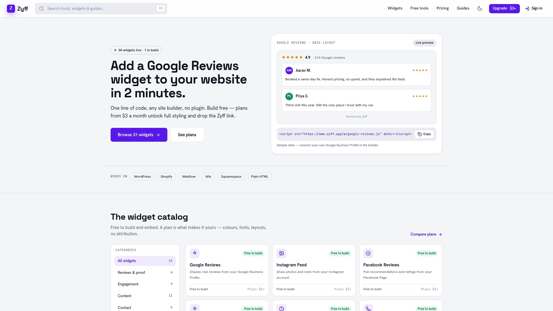
Getting a first pilot live takes minutes, not a development cycle. Create a free widget in the Zyff widget builder, preview it against your actual site, and copy the one-line embed into your platform of choice.
- Start with a free popup widget for your first exit-intent or offer test
- Add free social share buttons to a content page in minutes
- Try a free announcement bar for a time-sensitive message
- Check plans and pricing when you’re ready to remove branding or unlock higher view limits
If you want a broader view of experimentation and growth tactics beyond widgets, the CROWD Company blog covers marketing and growth topics that pair well with an engagement pilot. For most small sites, though, the fastest path to a result is picking one target action, embedding one widget, and watching what the numbers say over the next few weeks.
FAQ
What are the 7 C’s of a website?
There is no single official definition; common versions include concepts like clarity, content, consistency, and credibility as pillars of good website design. Treat it as a loose checklist rather than a fixed standard, since the exact list varies by source.
How to get 1000 website visitors per day?
Visitor volume depends on your traffic sources (search, social, paid, referral) and content strategy rather than any single tool or widget. Focus on consistent content production and conversion-friendly pages first, since engagement tools improve what happens after a visitor arrives, not how many arrive.
What are examples of CX tools?
Customer experience tools include live chat widgets, feedback and survey tools, analytics platforms for tracking behavior, and personalization engines that adjust content based on visitor data. Many of these overlap directly with the engagement categories covered above, like chat, surveys, and recommendation widgets.
What are the 5 best digital marketing tools?
The right tools depend on your specific goals, whether that’s email marketing, analytics, social scheduling, or on-site engagement, so there’s no universal top five. For on-site engagement specifically, a widget builder covering chat, popups, and reviews, paired with an analytics platform for measurement, covers most small business needs.
How do I know if an engagement widget is actually working?
Compare your target metric, like conversion rate or click-through rate, for a comparable time period before and after adding the widget. If the one-target-action workflow shows a clear lift beyond normal day-to-day variation, the widget earned its place; if not, remove it and test something else.
Sources
- 7 strategies for boosting website engagement and user interaction | Webflow Blog
- INP distribution: 91.9% of sites pass INP | The State of Web Vitals 2026
- 27 website design strategies that drive user engagement - GoDaddy Blog