5 Copy Ready Testimonial Examples, Baymard & FTC Safe, One Line Embed
5 Copy Ready Testimonial Examples, Baymard & FTC Safe, One Line Embed

The testimonial formats that convert best are short genuine video clips, a user photo paired with a one-line quote, a visible ratings distribution, before-and-after visuals, and short case studies. Below are copy-ready examples of each, plus templates, collection scripts, display rules grounded in Baymard research and FTC guidance, and a quick widget option from Zyff.
TL;DR:
- Short video testimonials of 15 to 45 seconds that follow a problem-solution-outcome arc tend to generate high sharing and conversion rates.
- Visible review distributions, including lower ratings, increase credibility and trust, especially when posted alongside reviewer photos and a gallery navigation.
- Before-and-after visuals work best for visual results and require clear disclosure to avoid misleading impressions.
- Testimonials should include specific problems, concrete changes, and measurable or sensory details, with consent secured for public use.
- Embedding testimonials with one line of code into any site builder makes it easy to display trusted proof across different pages.
Table of Contents
- Testimonial examples by format
- Matching testimonial formats to your marketing goal
- How to write a testimonial that holds up
- Collecting testimonials without annoying customers
- How to display testimonials so they build trust, not skepticism
- Putting these formats live with Zyff widgets
- Consent and privacy beyond disclosure
- An editorial note on authenticity versus polish
- A faster way to put testimonials on your site
- FAQ
- Sources
Testimonial examples by format
Different formats prove different things. A video proves a real person exists and sounds convinced. A photo quote proves someone used the actual product. A ratings distribution proves you aren’t hiding bad feedback. Here’s what each looks like in practice.
Video testimonials. Short clips (15 to 45 seconds) that follow a problem, solution, result arc tend to get shared on social and convert well on landing pages because viewers can read tone and hesitation, not just words.
- Example A: A dental practice films a patient saying, “I used to dread checkups. The team walked me through every step, and now I actually book ahead of time.” Placed on the homepage hero, right under the booking button.
- Example B: A SaaS founder records a 30-second clip: “We were losing leads in spreadsheets. Within a month of switching, our follow-up time dropped and nothing fell through the cracks.” Placed on the pricing page, near the signup form.
- Template: “I had [problem]. After trying [product/service], [specific change]. The part that surprised me was [detail].”
UGC photo plus one-line quote. A real photo (not stock) with a short caption outperforms a long written review because it’s scannable and visually verifiable.
- “Finally, a planner app that doesn’t make me feel behind.” - Maria T., small business owner (photo of her phone screen with the app open).
- “Arrived two days early and fit perfectly.” - Jordan R., customer (photo of the unboxed product).
- Template: “[One outcome in plain words].” - [First name, last initial], [role or context].
Star ratings with a visible distribution. Showing only five-star quotes reads as curated rather than honest. Baymard Institute research finds that 95% of shoppers rely on reviews to validate product details, and sites that hide the distribution or skip replies to criticism lose credibility.
- Example: A product page shows “4.6 out of 5, based on 312 reviews” with a bar chart showing the count at each star level, including the 2 and 3-star reviews.
- Why it works: a visible spread signals the reviews weren’t filtered.
Before-and-after. These work because they anchor the story to a relatable starting point, then show the payoff in one glance, which is especially strong for visual outcomes like fitness, skincare, home renovation, or design work.
- Example: A landscaping company posts a split image labeled “Before: overgrown side yard” and “After: patio installed in 3 weeks,” with a one-sentence caption from the homeowner.
- Caution: the FTC’s endorsement guides warn against dramatized or stock before-and-after images without clear disclosure of what’s typical.
Short case studies. A few paragraphs covering the client’s starting problem, what they tried, and a concrete result works well for higher-consideration purchases, and can be linked from a product page rather than displayed in full.
- Template: “[Client] needed [goal]. They tried [approach] but ran into [obstacle]. After [change], [specific result].”
Matching testimonial formats to your marketing goal
Not every page needs every format. Match the proof to the decision you’re asking someone to make.
- Quick conversions (checkout pages, signup forms): a short quote with name and role next to the CTA button, nothing longer.
- High-trust decisions (enterprise software, healthcare, big-ticket purchases): pair a video testimonial with a linked case study for depth.
- Ads and social: UGC photos with a star-rating snapshot tend to outperform brand-only creative, a pattern HubSpot’s video marketing data and similar marketing reports back up repeatedly.
- Product pages: a ratings distribution plus a scrollable gallery of reviewer photos, so shoppers can compare their situation to someone else’s.
A small retail site might run a UGC quote on its homepage, a full ratings distribution on product pages, and a 30-second video on its About page. Recommendations from people a buyer already trusts are the most persuasive channel available, according to Nielsen’s trust research, which found 89% of consumers trust recommendations from people they know over any branded message.
Pro Tip: Layer formats across a buyer’s journey. Show a photo quote in the ad, a ratings distribution on the landing page, and a case study link for anyone who scrolls past the first fold.
How to write a testimonial that holds up
A testimonial earns its spot when it names a specific problem, a specific change, and ideally a number or sensory detail. Use these as starting structures, then edit lightly.
- Short (one line): “[Outcome] because of [product].” Add name, role, and photo.
- Medium (2 to 3 sentences): Problem, what changed, one result. “Our checkout was confusing. After the redesign, fewer customers abandoned their cart, and support tickets dropped too.”
- Long (short case study): Starting point, approach tried, obstacle, result, one quote pulled out for emphasis.
Editing checklist before publishing:
- Keep the person’s actual phrasing; smooth grammar, don’t rewrite their voice.
- Add identity: full name or first name and last initial, role, and a real photo when possible.
- Verify any metric or claim mentioned before it goes live.
- Get written or checkbox consent to use the quote, name, and photo publicly.
For video, three follow-up questions pull out usable material: “What was frustrating before you started?” “What specifically changed?” and “Would you tell a friend why, in one sentence?”
Collecting testimonials without annoying customers
The biggest barrier to getting testimonials isn’t customer willingness, it’s friction. Baymard’s research found that many sites lose review volume by requiring account creation or long forms before a customer can leave feedback.
- Send a short email 3 to 7 days after delivery: “How’s it going so far? One sentence would help other shoppers decide.”
- For B2B customers, ask a specific contact directly after a renewal or successful onboarding call, rather than a generic blast.
- For in-app prompts, trigger the ask right after a completed action, like a finished project or a hit milestone.
- Keep the form to three fields: quote, name, optional photo or video upload.
- Use a single checkbox for permission to feature the response publicly, with the disclosure text visible inline rather than buried in a separate document.
- If you offer an incentive (a discount, a gift card) for leaving a review, say so plainly next to the request, since the FTC’s updated guides treat incentivized reviews as needing the same disclosure as any paid endorsement.
- Respond to negative reviews within a few days. Most sites don’t, and it shows.
How to display testimonials so they build trust, not skepticism
Placement matters as much as content. A testimonial buried in a footer does nothing; one placed where a visitor is deciding does a lot.
- Put one short quote in the hero section, near the primary CTA.
- Put a fuller set (ratings distribution, photos, a case study link) on the product or pricing page, where buyers compare options.
- Show 3 to 5 quotes per page rather than one or a wall of them. Too few looks sparse, too many looks like padding.
- Include a name, role or location, and photo wherever possible. Anonymous quotes read as less credible.
A visible ratings distribution changes how reviews get read. Baymard’s summary research found that shoppers grow suspicious when a product shows only five-star reviews, and that displaying the full breakdown, including the lower scores, increases credibility rather than hurting it.
Reviewer-submitted photos deserve their own navigation. Baymard’s usability testing found that shoppers expect to browse a gallery of customer photos and move between them easily; blocking that navigation frustrates users and can cost you the sale. On mobile, that means a swipeable gallery, not a cramped grid that requires pinching to see detail. For a deeper walkthrough of placement and layout choices, see our guidance on displaying testimonials.
Putting these formats live with Zyff widgets
Once you know which formats fit your page, the fastest path is embedding them directly rather than rebuilding your site. We built Google Reviews and Facebook Reviews widgets for ratings distributions, a before-and-after slider for visual transformations, and a social gallery for UGC photos, each dropping into any site with one line of code. Our tools stay free and unmetered on every plan, so you can prototype a display before deciding what to upgrade.

Consent and privacy beyond disclosure
Disclosure covers whether a relationship exists between you and the person endorsing your product. Consent and privacy are separate questions: did the person agree to have their name, photo, or words published, and for how long?
A verbal “sure, go ahead” from a customer isn’t the same as documented consent. Keep a record, even a simple timestamped checkbox tied to the submission, showing the person agreed to be featured publicly. This matters more when you plan to reuse a quote in paid ads, since ad platforms and some state laws treat commercial use of someone’s likeness more strictly than a webpage quote.
If a testimonial includes identifying details beyond a first name (a workplace, a medical condition, a child’s photo), get specific sign-off for that detail rather than assuming a general release covers it. For healthcare, finance, or legal-adjacent businesses, this is especially important since testimonials there often touch on sensitive information that general marketing consent forms don’t anticipate; the best practices documented for healthcare SaaS customer testimonials are a useful reference for handling that kind of case.
Give people a way to ask you to remove their testimonial later. It’s a small courtesy, and it keeps you from publishing something a former customer no longer stands behind.

An editorial note on authenticity versus polish
Edit for clarity, never for voice. Fix a typo, trim a rambling sentence, but keep the customer’s actual words and cadence; an over-polished quote reads as written by marketing, which defeats the purpose. Always verify a number before it goes live, and disclose incentives plainly, even when it feels like it might soften the message.
— Ashok
A faster way to put testimonials on your site
We built Zyff so you don’t need a developer to show the proof you’ve already collected. Every widget, from review strips to before-and-after sliders to a team showcase, embeds with one line of code on any site builder, and the core toolset stays free with no watermark forced on you.
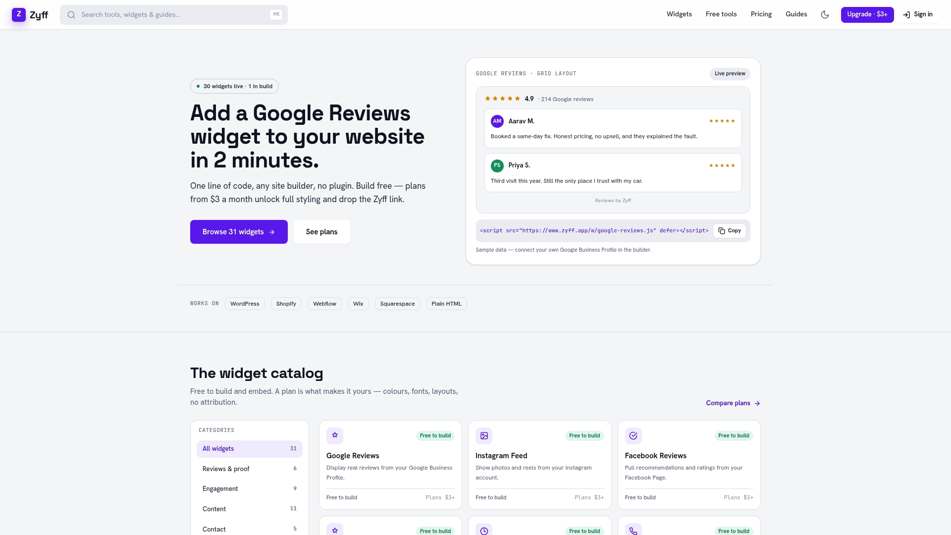
If you’re testing formats before committing to a layout, the free tier lets you build and preview widgets without a time limit. When you need more saved widgets, deeper styling control, or branding removed entirely, paid plans start at $3 a month.
- Preview a review widget on your own site with the widget builder.
- Compare plans on the pricing page when you’re ready for more customization.
- Browse the team showcase widget if you want to pair testimonials with the people behind them.
FAQ
How do I write a testimonial?
Start with the problem the person had, what changed after using the product, and one specific detail or result. Keep their actual phrasing and add their name, role, and a photo for credibility.
What is a short testimonial?
A short testimonial is typically one or two sentences: a specific outcome paired with the customer’s name and role, often shown near a call-to-action button. It works because it’s scannable and doesn’t ask for extra reading time.
What makes a testimonial good?
A good testimonial names a specific problem and a specific change rather than a vague compliment, and it includes a real name, photo, or other identity marker. Testimonials that include a visible ratings distribution alongside quotes read as more honest than a wall of five-star-only reviews, based on Baymard’s usability findings.
What does a strong positive review look like?
A strong positive review mentions a specific detail, like how an issue was resolved or how a product performed in a real situation, rather than a generic “great service.” Reviews that read as personal and detailed tend to carry more weight with other shoppers than short, generic praise.
Sources
- Federal Trade Commission press release: updated advertising guides (June 2023)
- Baymard Institute research on responding to negative user reviews
- Nielsen: Trust in Advertising (U.S. one-sheet)