Protect Core Web Vitals: Mobile Popup Design With 44×44 Tap Targets
Protect Core Web Vitals: Mobile Popup Design With 44×44 Tap Targets

Effective mobile popup design stays visible without blocking the page underneath it, asks for one thing at a time, and loads without shifting anything else on screen. It respects thumb reach, meets accessibility standards, and follows Google’s rules on intrusive interstitials. Get those pieces right and a popup can lift conversions instead of driving visitors away.
TL;DR:
- Mobile popups should be triggered after user engagement signals like scroll depth or a second pageview, not immediately upon page load.
- Keep popup width between 300 and 500 pixels, with large, thumb-friendly buttons measuring at least 44 by 44 CSS pixels for accessibility.
- Use small, delayed, and easily dismissible designs such as bottom bars, corner cards, or modest banners to avoid Google’s intrusive interstitial penalties.
- Ensure popups comply with GDPR and accessibility standards by providing clear close controls, focus trapping, and separate legal consent flows.
- Tools like Zyff let you create and embed mobile-only popups quickly, with minimal form fields, swipe-to-close support, and customizable frequency caps.
Table of Contents
- Practical examples and layouts that work on mobile
- Design rules for high-converting mobile popups
- Google interstitial guidance and accessibility rules you must follow
- When to show mobile popups (triggers that respect engagement)
- Technical patterns that protect Core Web Vitals and make popups fast
- How to implement these patterns with Zyff’s popup widget
- Legal compliance related to mobile popups (cookie consent laws, GDPR)
- Author perspective: trade-offs between conversion and user experience
- Zyff: build a mobile-friendly popup quickly
- Sources
- FAQ
Practical examples and layouts that work on mobile
A popup’s shape decides whether it feels helpful or hostile. On a small screen, the safest patterns leave room for the reader to keep reading, browsing, or scrolling while the offer sits in view.
- Bottom-docked bar: a slim strip anchored to the bottom of the screen, ideal for newsletter signups; one field, one button, dismiss with an “X” on the right.
- Centered modal (delayed): a compact card that appears after meaningful scroll, good for discount codes; single email field plus a CTA like “Get 10% Off.”
- Top teaser banner: a shallow bar below the header, suited to app-download prompts or shipping notices; no fields, just a link or button.
- Slide-in corner card: appears from the bottom corner after a scroll trigger, useful for content upgrades like guides or checklists; one field, one CTA.
- Fullscreen offer (high-value only): reserved for one-time discounts or gated content on exit or after strong engagement; one field, large CTA, and a clearly visible close control.
Each of these works because it never fights the reader for space they didn’t offer to give up. The pattern to avoid is a fullscreen popup that fires the instant someone lands on the page, before they’ve read a sentence. That shape mirrors exactly what Google’s guidance on intrusive interstitials flags as harmful to mobile usability, and it’s also the version most likely to get closed without a second look. Save fullscreen for moments the visitor has already earned through scroll depth or exit signals, not for the first second on the page.
Design rules for high-converting mobile popups
Small screens punish friction. A popup that asks for too much, sits in the wrong place, or won’t close easily gets dismissed or ignored, and repeated exposure trains visitors to stop noticing it altogether.
- Ask for one field. An email address is usually enough; every extra field lowers completion rates on a touch keyboard.
- Write a benefit-led headline in under 10 words. State what the visitor gets, not what your brand does.
- Put the CTA in the thumb zone. The bottom third of the screen is easiest to reach one-handed on most phone sizes.
- Make the CTA button large and obvious. Sizing it to the WCAG 2.2 minimum target guidance of around 44 by 44 CSS pixels keeps it tappable for users with limited dexterity.
- Show the close control clearly. An “X” in a corner with enough padding around it, plus support for a swipe-down gesture, gives visitors an easy exit.
- Cap frequency. Show a popup once per session at most, and suppress it entirely for a set number of days after a dismissal.
- Delay the trigger. Avoid firing on page load; wait for a scroll or time threshold instead, covered in more detail further down.
Pro Tip: Test your CTA button with a thumb, not a mouse cursor: what looks tappable on a laptop screen often isn’t on a phone.
Popup sizing matters as much as placement. Guidance from Omnisend on mobile-friendly popup forms recommends keeping mobile popups at a narrow, thumb-friendly width with single-field layouts and larger buttons than you’d use on desktop. Building a separate mobile-only version of a form, rather than shrinking a desktop design, tends to avoid the layout problems that come from cramming a multi-field form into a small viewport.
Google interstitial guidance and accessibility rules you must follow
Two sets of rules govern whether a mobile popup helps or hurts: search visibility rules from Google and accessibility rules for people using screen readers, keyboards, or switch devices.
Google’s own guidance names three intrusive patterns to avoid on mobile:
- A popup that covers the main content immediately after arriving on a page from search results.
- A standalone interstitial that has to be dismissed before the visitor can reach the content they clicked for.
- A layout that uses an above-the-fold section styled to look like a standalone interstitial, pushing real content below the fold.
The same Google Search Central guidance exempts small banners, cookie or age-verification dialogs, and login prompts that are easy to dismiss, which is why the patterns in the previous section lean toward small, delayed, and easily closed designs.
One touch-target standard covers most accessibility complaints: the WCAG 2.2 target size guidance recommends interactive elements measure at least 44 by 44 CSS pixels, a size chosen to accommodate common finger sizes and users with limited motor control.
Beyond sizing, a few practical steps close most remaining gaps: place the dialog next to its trigger in the page’s DOM order so screen readers and keyboard focus land on it correctly, trap focus inside the popup while it’s open, and return focus to the triggering element once it closes.
When to show mobile popups (triggers that respect engagement)
Timing decides whether a popup feels earned or intrusive. A popup that fires the moment someone lands on a page has no context for what that person wants, while one triggered by behavior signals genuine interest.
- Scroll depth past the halfway point signals a visitor is engaged enough to consider an offer, per Omnisend’s timing guidance.
- Second pageview works well for return visitors browsing past a single product or article.
- A short delay of several seconds on the current page can substitute for scroll depth on shorter pages.
- Exit intent, reliable on desktop through cursor movement toward the browser edge, doesn’t translate directly to touch devices; a scroll-up gesture or a tab-switch event is the closer mobile equivalent.
- Session or cookie-based frequency caps should suppress a popup for several days after it’s dismissed once, and permanently after a conversion.
Running an A/B test between two trigger points, say 40% scroll against 60% scroll, is a fast way to find the balance between reach and irritation for a specific audience.
Technical patterns that protect Core Web Vitals and make popups fast
A popup that shifts the page around it or freezes the screen on close will cost more in performance penalties than it gains in signups. Reserve space for the popup with a fixed-position overlay rather than inserting it into the normal document flow, since an in-flow banner that pushes content down creates the kind of layout shift that damages Cumulative Layout Shift scores.
- Render the popup’s HTML and assets lazily, only once its trigger condition is met, rather than on initial page load.
- Defer non-critical JavaScript tied to the popup so it doesn’t compete with the page’s main content for load time.
- Use
requestIdleCallbackfor cleanup tasks after dismissal, and consider lazy de-rendering (hiding the popup withdisplay: nonebefore removing it from the DOM) to keep dismissal snappy. - Measure the popup’s effect on Largest Contentful Paint and CLS separately from the rest of the page, and watch Interaction to Next Paint on the close button specifically.
Pro Tip: Test your close button’s response time on a mid-range phone, not a flagship device: that’s where slow dismissal handlers show up first.
How to implement these patterns with Zyff’s popup widget
Zyff’s popup widget is built for exactly this kind of setup: a single line of code embeds it on any site, and a device-visibility setting lets you build a version that shows only on mobile screens. Inside the builder, you can trim a form down to one field, size the CTA button generously, and turn on swipe-to-close for a touch-native feel. Frequency rules for how often the popup reappears per visitor are part of the same setup screen, so the caps recommended earlier take a few clicks rather than custom code. For sites already using Zyff widgets, the HTML installation guide covers the same embed pattern used across the widget library.

Legal compliance related to mobile popups (cookie consent laws, GDPR)
A popup asking for consent, age verification, or cookie preferences sits in a different legal category from a marketing popup, and mixing the two causes problems. Regulations tied to the EU’s GDPR and similar frameworks in other regions typically require that cookie consent be requested before non-essential tracking scripts run, not after, and that declining be as easy as accepting. A marketing popup that also happens to load tracking pixels before consent is captured can create compliance exposure independent of how well it’s designed.
Google’s exemption for consent and age-verification dialogs, noted earlier, only applies when those dialogs are easy to dismiss and don’t block the underlying content indefinitely. A cookie banner that traps the visitor until they choose an option, rather than offering a clear close or “reject” path, risks both a poor user experience and friction with consent requirements that expect a genuine choice.
Keep marketing popups and legal-consent dialogs visually and functionally distinct: different triggers, different dismissal behavior, and never combined into a single dialog that asks for an email address and cookie consent at once. For a dialog that specifically needs to gate content, such as age verification, building it as its own compliant flow rather than repurposing a marketing popup template avoids conflating the two sets of rules.

Author perspective: trade-offs between conversion and user experience
A sticky bottom bar tends to beat a modal when the goal is discovery, since it lets a visitor keep browsing while the offer sits in view. Choose timing based on what happens after the click, not just the click itself: a popup that interrupts someone three seconds into an article costs more in bounce than a well-placed one costs in reach. Test for post-click engagement alongside conversion rate, not conversion rate alone.
— Ashok
Zyff: build a mobile-friendly popup quickly
Most popup tools charge for the customization options that actually matter on mobile, like device targeting or removing their own branding. Zyff keeps its popup widget and the rest of its widget builder free to build and embed, with no watermark forced onto the free tier and no account required to start.
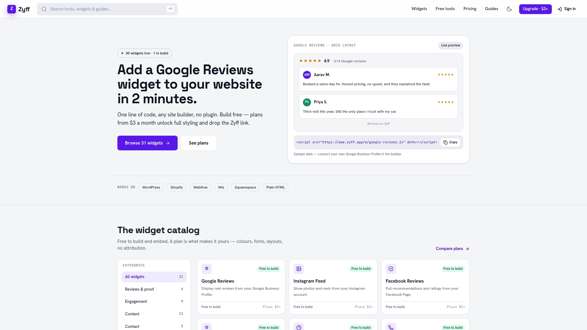
Getting a compliant, mobile-first popup running takes a few steps:
- Open the popup widget and choose a mobile-only visibility setting.
- Strip the form to a single email field and pick a large CTA button style.
- Turn on swipe-to-close and set a once-per-session frequency cap.
- Copy the one-line embed code into your site, whether that’s plain HTML, Wix, or another builder.
Start with the free popup widget to test the layout on your own traffic, then check the pricing page if you need higher view limits or full branding removal down the line. For a deeper look at what drives mobile conversion loss beyond popup design, Save Your App covers broader friction points worth ruling out.
Sources
- Helping users easily access content on mobile | Google Search Central Blog
- Set Up Mobile-Friendly Popup Forms | Omnisend Help Center
FAQ
What size should a mobile popup be?
Most guidance recommends keeping the popup itself between roughly 300 and 500 pixels wide, matching the width range Omnisend recommends for mobile-friendly forms. Buttons and other tappable elements inside it should follow the WCAG target size guidance of about 44 by 44 CSS pixels.
Do popups hurt mobile SEO?
A popup can hurt visibility in search results if it blocks the main content immediately on arrival or acts as a standalone interstitial the visitor must dismiss before reading anything, patterns Google’s guidance specifically warns against. Small banners, consent dialogs, and easily dismissible popups triggered after some engagements are exempted from that penalty.
When should a mobile popup appear?
Triggers based on behavior, such as reaching 50% scroll depth or a second pageview, tend to outperform an immediate on-load timer because they wait for a sign of genuine interest, an approach Omnisend’s timing recommendations reflect directly. A short delay of a few seconds can substitute for scroll depth on pages too short to measure meaningful scrolling.
How do I make a mobile popup accessible?
Give the close control a large, clearly labeled tap target sized to the WCAG minimum guidance, and make sure keyboard and screen reader focus move into the dialog when it opens and back to the page when it closes. Support a swipe gesture to dismiss on touch devices in addition to a visible button.
Can I build a mobile-friendly popup without coding it myself?
Yes. Widget builders such as Zyff’s popup widget let you set mobile-only visibility, single-field forms, and swipe-to-close through a builder interface, then embed the result with one line of code.